It’s not the numbers – it’s what’s in your head
Most SMBs Don’t Need a Dashboard – but they are cool. Here’s how to use one if you need to.
Dashboards Track Output
When you realize your company is an organization of outputs performed by people, you want to know if the right outputs are being produced. A dashboard is a visual way to do this. Like a car dashboard, its purpose is to gather relevant information in a central place often with visual representations for quick understanding. But that’s not what’s most important in a dashboard. The most important part is what’s in your head. What are you going to do based on what you see in the dashboard?
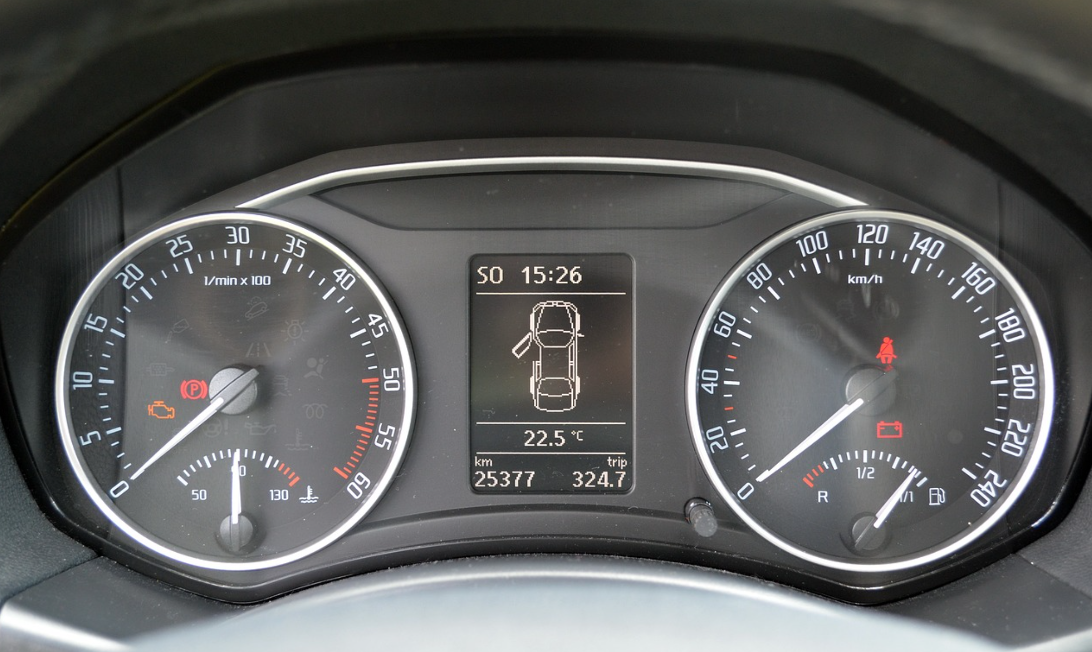
Most modern car dashboards have two large circular gauges. The speedometer tells you how fast you’re going and you know what to do about that because it’s entirely dependent on how hard you press the gas pedal. The tachometer is only there for decoration. It tells you how fast your engine is spinning and that depends on how hard you press the gas pedal PLUS what gear you’re in which you have no control over in most cars. So it’s really just there to look nice. (The dashboard in the picture also tells you one of your car doors is open, and you’ll probably want to do something about that before you take off.)
A poorly designed dashboard can be distracting – or worse.
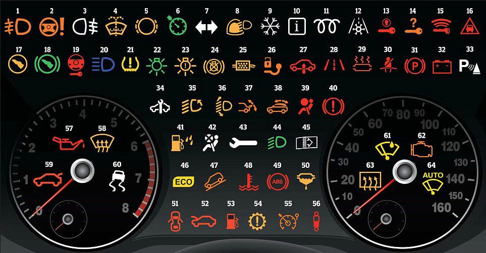
Having lots of pretty vanity metrics on your dashboard can cause you to focus on things that don’t matter or that you can’t control. And if the dashboard is not designed properly you won’t even know what the pretty colors mean. This happens in the car with those icons that light up. How many of these make sense to you?
Here are the important parts of a dashboard.
The data source
Usually it’s a number that comes from a report or a cell in a spreadsheet. Then it’s either put right into the dashboard or some formula is applied to it and the result is put in the dashboard. It’s important that the source is known and up to date, and the formula is known and trusted. Dashboard consultants love to concoct ways for this to all happen automatically. But beware of people not trusting the data when that happens. It can be more useful for a person to be responsible for putting that number in so they can verify it and stand behind its accuracy.
The frequency
How often the data is updated and how often you look at it are critically important. A lot of financial data can’t be trusted more frequently than once a month because it requires the work of closing the books to be accurate. But other data – like cash on hand – can be updated daily. This is usually too frequently to matter but if your company is in a precarious cash position that frequency might be necessary.
Some dashboards that are specific to a certain machine or process might need to be checked many times a day.
The graphic display
A number is important but not useful by itself. If you had $2M in revenue last month, is that good? Is it bad? You have to know what it compares to in order to know. A good graphic display does that comparison for you – visually and instantly. A poor one makes a useless comparison or worse, a wrong one. Here are common types of graphic displays and when they should be used. All of these can be done in either Google sheets or Excel.
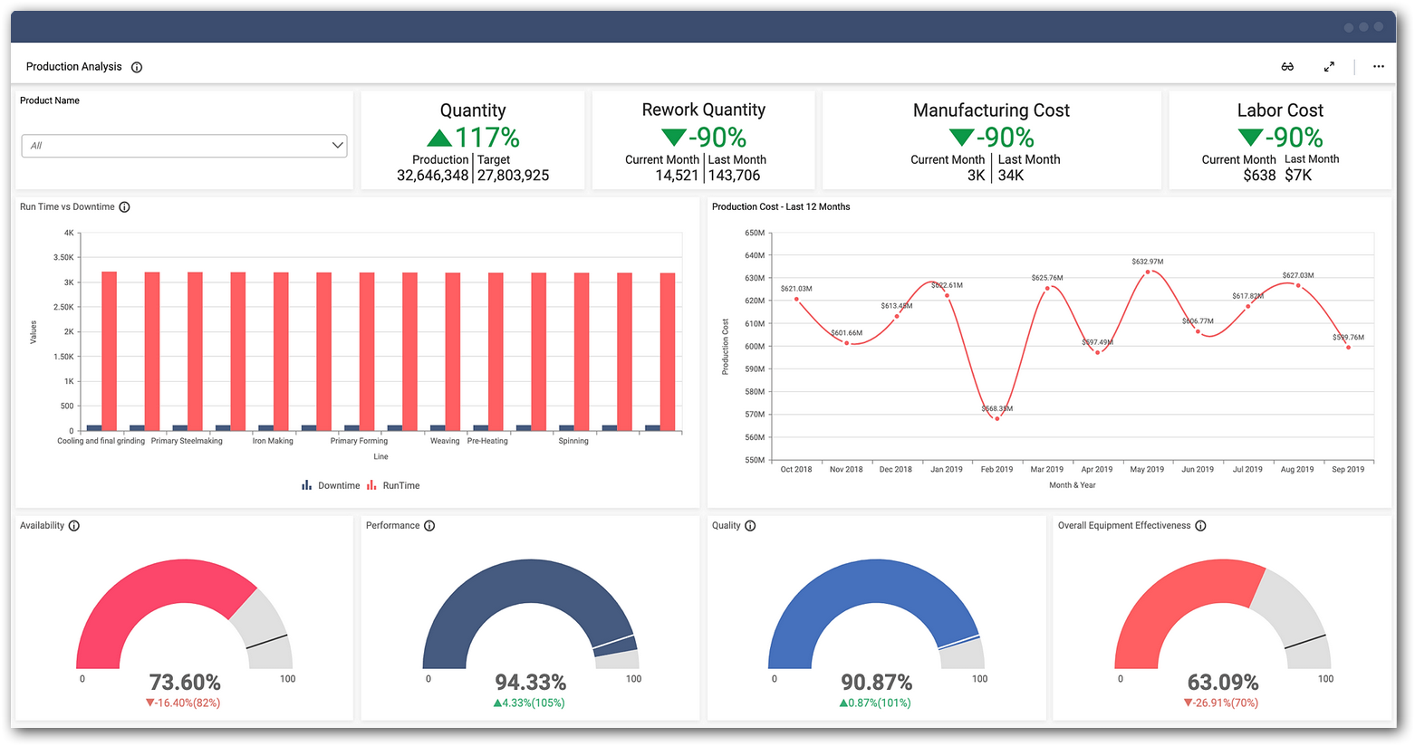
Red Yellow Green. It’s common to color a number as a traffic light. Green is go – everything is on track. Yellow is a warning – better check this out. Red means danger – thing is in trouble. Where you set the color changes is important.
A gauge. This compares the current number to the maximum. Your speedometer doesn’t go to 1,000 mph – it only goes to some (mythical) maximum your car is capable of. The key is what you set the maximum at. Usually it’s your goal, but with the tachometer in your car it’s the danger zone.
A bar chart compares two (or more) numbers to each other. It might show revenue this month compared to last month. Or this month compared to the same month last year. What’s being compared is what makes this useful.
A line graph shows changes over time. It helps you see trends. One key here is whether you track the raw numbers or a moving average. A moving average is better for numbers that jump around a lot – it smooths out those variations so the trend is more visible.
The acceptable range
Each number needs an acceptable range. If it falls within that range you can ignore it. This range can be used to determine which type of graphic display is best. The range should be described specifically – not intuitively. If the number is outside of that range then you need the next to take some action.
The response or action you’ll take
This is the most important part of the dashboard and usually it lives in someone’s head. If you’re not going to take some sort of action when the number is out of range, why is it even on the dashboard. Is it like the tachometer – just for looks?
The response actions are of two types. Type one is where the action is predictable in advance. For example, if an inventory level gets too low, the action is to order more. It’s useful to document these actions in a standard operating procedure (SOP).
The second type is more nuanced. The action might be to watch it for a while and see if it’s a blip or a trend. That’s often very useful – most numbers bounce around a lot and you don’t want to cause harm by reacting too fast. But you should have some idea of what constitutes a trend. Or the action might be to look deeper into other numbers to determine the cause of the situation. Then ultimately you decide to take some action (or not).
The problem with a dashboard
The biggest problem with a dashboard is it can distract you from really seeing what you need to see. Sometimes a dashboard is so broad brush it doesn’t indicate a problem until it’s large, when it could have been solved easier if you’d seen it sooner. Other times the slickness of the images makes you gloss over what they really mean. That’s why I encourage you to get your hands dirty, and really dig into the numbers on a regular basis. This is especially true for SMB owners.
Takeaways
Make sure your dashboard is measuring relevant data. Fewer data points is usually better than more.
Make sure someone is responsible for each number – even if it populates the dashboard automatically.
Show the number in the most useful graphic format to decide what to do.
Know what the acceptable range is and what you’ll do if the data is out of range.